Description of the problem
When building portfolios of stocks, investors seek to obtain good returns while limiting the variability in those returns over time. In this problem, we will use clustering to identify clusters of stocks that have similar returns over time. Can we provide investors with a suggestion on how to build their portfolio based on your clustering analysis?
We will use the dataset NasdaqReturns.csv, which contains monthly stock returns from the NASDAQ stock exchange during 2000-2009. The companies selected in this dataset are limited to those that were listed on the stock exchange for the entire time period and their stock price never fell below $1. The NASDAQ is the second largest stock exchange in the world, which contains many technology companies. The dataset used for the project can be downloaded through this link.
The variables are described in the table below.
Variable | Description |
StockSymbol | The symbol identifying the company of the stock. |
Industry | The industry the stock is classified under. |
SubIndustry | The sub-industry the stock is classified under |
Ret2000.01-Ret2009.12 | The return for the stock during the variable's indicated month. The variable names have the format "RetYYYY.MM", where YYYY is the year and MM is the month |
What you will build
- Hierarchical clustering
- K-means++ clustering
What you will learn
- Explore the data by using pandas and matplotlib
- Understand unsupervised learning method: clustering
- Cluster the data using hierarchical clustering
- Cluster the data using K-means++ clustering and use PCA to reduce the dimension to visualize the K-means++ clusters
- Compare the results from hierarchical clustering and K-means++ clustering
Check all the packages you need
- pandas
- numpy
- matplotlib
- scipy
- seaborn
- sklearn
First, use pandas pd.read_csv to read the csv file. Since the dataset does not have any invalid value, you can skip the step of cleaning the data.
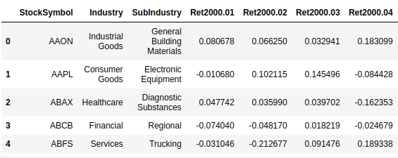
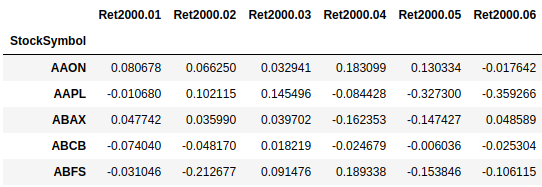
Below are the top 5 rows in the dataset (part of all the columns):
Question 1
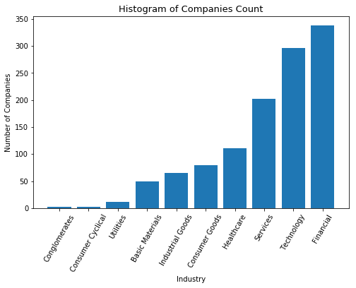
How many companies are in the dataset? How many companies are there in each of the industries?
To group the same company, you can group by the "StockSymbol" column. The result shows there are 1158 companies in the dataset with no duplicated companies.
When grouping by the "Industry", you will see how many companies in each industry exist.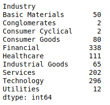
Question 2
In the aftermath of the dot-com bubble bursting in the early 2000s, the NASDAQ was quite tumultuous. In December 2000, how many stocks in this dataset saw their value increase by 10% or more? Decrease by 10% or more?
Answer:
There are 309 stocks whose value increase by 10% or more while there are 261 stocks whose value decrease by 10% or more.
Question 3
Entering the Great Recession, most stocks lost significant value, but some sectors were hit harder than others. In October 2008, which industries had the worst average return across all stocks in that industry?
Answer: The mean value of the proportional change in each industry is shown below.
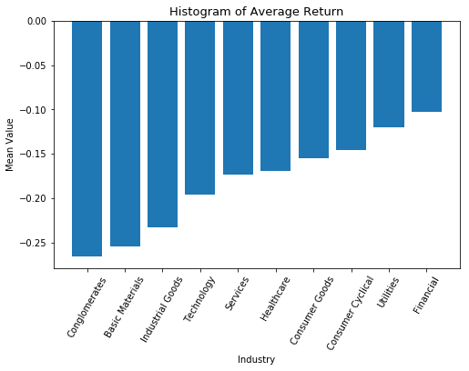
"Conglomerates" has the worst average return across all stocks in that industry.
Before clustering, it is important to remember that you are just clustering the observations based on the variables Ret2000.01 - Return2009.12. "StockSymbol", "Industry", and "SubIndustry" variables are not used to cluster the observations. You can create a new dataset only containing the variables Ret2000.01 - Return2009.12.
Below is a new dataframe created by removing "Industry" and "SubIndustry", then set "StockSymbol" as the index.
Question 4
In this analysis, we will not normalize our data prior to clustering. Why is this a valid approach for this problem and dataset?
Answer:
Because all the value of proportional change are on the same scale, we do not need to normalize them again.
Question 5
Cluster the data using Hierarchical clustering. Clearly indicate which distance metrics you used for point distances and cluster distances. Plot the resulting dendrogram. What do you think are reasonable choices for the number of clusters to select, based on the dendrogram? How about for the application? Select a specific number of clusters to use for the rest of the problem, and justify your choice.
Answer:
Create a linkage of hierarchical clustering by using Euclidean distance
There are several methods on hierarchical clustering in scipy. read the documentation to learn about it. In the notebook, we will use "ward" method, which is the ward variance minimization algorithm to do clusters.
Now, let's plot the hierarchical clustering using a dendrogram!
When using the "level" as truncate model, which shows no more than p levels of the dendrogram tree are displayed, the dendrogram should look like this:

When using the "lastp" for truncate model, which shows only the last p merged clusters, the dendrogram should look like this:
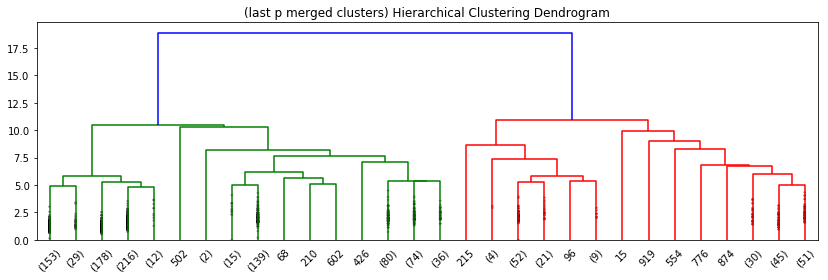
From the dendrograms, we can see two clusters (green cluster and red cluster). In fact, the green cluster has a larger cluster, where there are also two clusters. (one's level is 6 and another one is 11).
You can also try to plot a matrix dataset as a hierarchically-clustered heatmap by using seaborn.clustermap package. If you plot the clustermap using the dataframe directly, the plot looks like this:
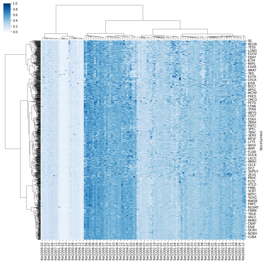
The color distribution in this cluster map basically shows the clusters of dates, which does not help you to visualize the clusters of stocks. However, when you transpose the data frame, you will see a clearer map to visualize the clusters.
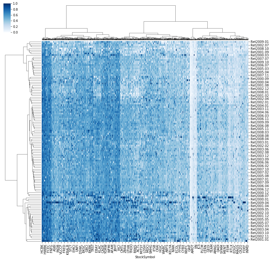
In the second map, the color distribution shows the clusters based on the stock symbols. Although there are overlapping area between the clusters, we can still tell the boundary between them.
Silhouette clustering
One of the methods to select the number of clusters more efficiently is to compute the mean Silhouette Coefficient of all samples to select the number with best performance. Silhouette analysis can be used to study the separation distance between the resulting clusters. The silhouette plot displays a measure of how close each point in one cluster is to points in the neighboring clusters, giving a way to assess parameters, such as the number of clusters visually. Read more about the computing method of Silhouette clustering by using sklearn.
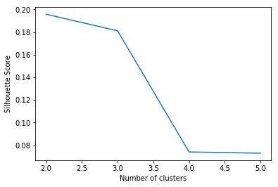
From the Silhouette Score plotting, the score drops dramatically from 3 clusters to 4 clusters with the highest score being 2 clusters. However, 2 clusters is unreliable compared with 3 clusters, so let's select 3 as the optimal number of clusters. Then, use fcluster() to form 3 flat clusters from the hierarchical clustering and create a new column "H_cluster" to store the result.
Question 6
Extract cluster assignments from your hierarchical clustering model, using the number of clusters you selected in the previous problem. Describe each cluster, using the number of observations in the cluster, the industry of the companies in the cluster, and the sub-industry of the company in the cluster. (Since we never changed the order of the observations, you can use the cluster assignments together with the original dataset to extract information about the industry and sub-industry.)
The plot below shows the mean return of each cluster:
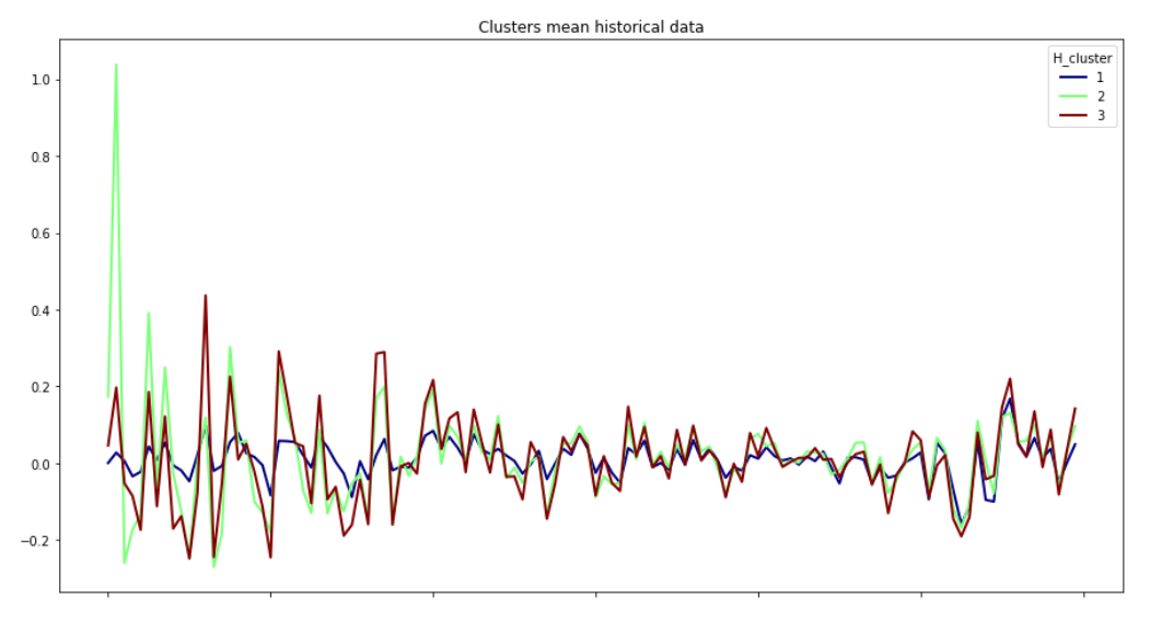
You can see Cluster 2 is more volatile than the other two clusters during the earlier time, yet it becomes stable later on. In fact, all the clusters show similar move as time goes. Similarly, Cluster 3 has some fluctuations in the beginning, but not as much as Cluster 2. Cluster 1 has the most stable mean return of all. However, we cannot get additional useful information from this plotting. So let us plot all the stock's return value in each cluster and compare them with the highlighted mean value of that cluster.
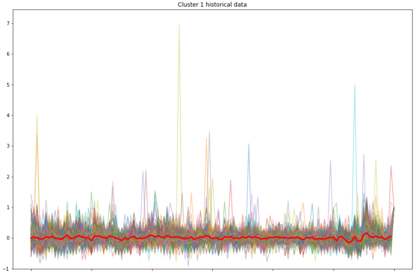
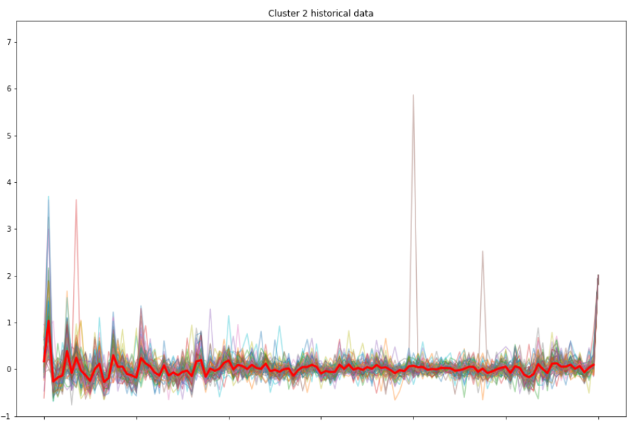
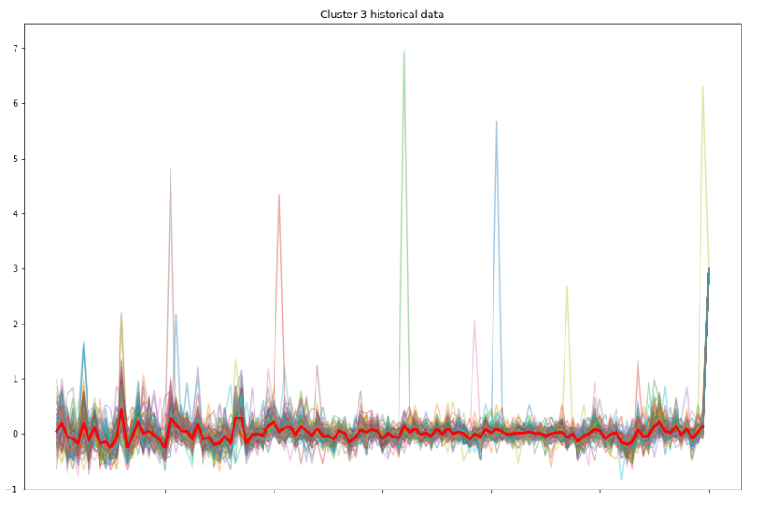
It is hard to gain some useful information in the first cluster plotting figure, since the line of mean value is flat and there is no striking trend similarity between each return value. That is because the first cluster has the greatest number of stocks, size of 939, which makes the line chart more stable.
However, the second cluster (size of 88) and third cluster (size of 131) have smaller size which helps us to visualize the trends more clearly. And from the trends, we can say the in one cluster, the samples share a similar trend.
Question 7
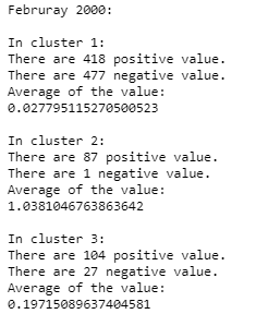
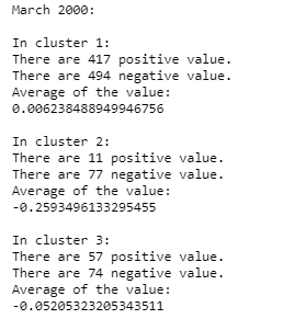
For some months, we expect there to be significant differences between the returns of stocks in different clusters. For February 2000, do some clusters have negative average returns while other clusters have positive average returns? How about for March 2000?
Answer:
Question 8
Now run the K-means clustering algorithm on this data (when clustering, only use the variables Ret2000.01 - Ret2009.12). You should select the same number of cluster assignments from your K-means clustering model, and compare them to the Hierarchical cluster assignments. Are the clusters similar or different?
To perform K-means clustering, you can use cluster.KMeans package in sklearn.
We will be using 'k-means++' method for initialization, which selects initial cluster centers for k-mean clustering to speed up convergence. After clustering, store the result in "K_cluster" column.
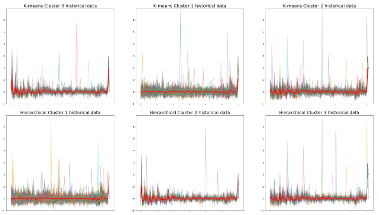
You can try the same thing that you did in hierarchical clustering and compare these two methods by plotting them. It is clear to see that those clusters from the two methods have similar trends.
Another method to use for visualizing K-means clusters is principal component analysis (PCA), where the dimension is reduced from 120 to 2.
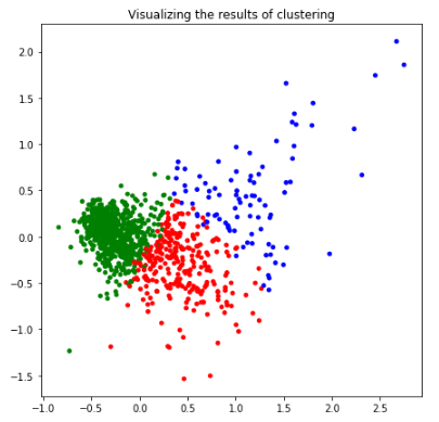
You can tell green is the most stable cluster, whereas the variables in the blue cluster are more scattered than those in the other clusters.
Question 9
Propose a diverse portfolio of stocks using the results of your clusters. When selecting your stocks, how do you think you could best use the results of the Hierarchical clustering algorithm and the K-means clustering algorithm?
Answer:
- Conservative investment would be investing in more stocks in cluster 1 since cluster 1 is most stable based on both of the clustering methods.
- Investing in some stocks that are in cluster 2 and 3 from hierarchical clustering, or cluster 0 and 2 from K-means clustering would expect higher returns although they have higher risk.
Bertsimas.D, O'Hair.A.K, Pulleyblank.W.R (2016) The Analytics Edge