Description of the problem
Lending Club strives to connect borrowers with investors through our online marketplace.
The goal is to predict the interest rates that Lending Club should use, based on previous borrowers data they have. Whether or not a client will repay a loan or have difficulty is a critical business need. In this project, we are going to see some models that the machine learning community can develop to help organizations like Lending Club.
What you will build
- Machine learning models to predict interest rates.
What you will learn
- Module 2: Clustering analysis and building machine learning models
The experimentation will be done in Jupyter Notebooks, primarily in Python3.6.
- pandas
- numpy
- matplotlib
- seaborn
- scipy
- sklearn
In this project, we are going to use the same Lending Club loan dataset as in the previous module. The provided file is a cleaned version of the original Lending Club dataset available at Kaggle. The files provided includes a file containing the description of the features, LCDataDictionary, and the data file named LendingClubLoan.csv.
The original version of the dataset is about 230mb. The version provided is a subset of 9999 samples of the cleaned dataset. Let us first take a look at some of the features in the given dataset. The entire list can be found in the jupyter notebook.
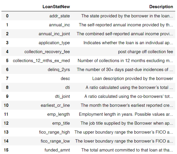
Here is a look at some of the entries in the dataset:

k- Means Clustering
The k-means algorithm searches for a pre-determined number of clusters within an unlabeled multidimensional dataset. According to this algorithm, a simple cluster:
- has a "cluster center" which is the arithmetic mean of all the points belonging to the cluster
- has each point closer to its own cluster center than to other cluster centers
Selecting the value of k
One of the most important parameters that has to be decided by the user is the value of k, the number of cluster. K random centroids are selected and the centroids are moved with each iteration of the algorithm until all points are assigned a cluster.
To select the value of K, one of the widely used method is called the Elbow Curve method. Logically, K-Means attempts to minimize distortion defined by the the sum of the squared distances between each observation and its closest centroid. This is called the cost function or distortion. We plot the values of distortion against K and select where the plot forms an 'elbow joint' i.e. the point after which there is a gradual decrease in the distortion.
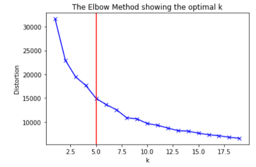
The distortion values will eventually reach 0 when the value of K is equal to the number of samples in the dataset, which is same as having one cluster for each point and is undesireable. In this experiment, the distortion changes by 15000 in the first 5 K values and then by 5000 in the next 15 K values. So we select K = 5 as the elbow point.
Sample per cluster for the given dataset
Samples per cluster:
[[ 0 5210]
[ 1 1054]
[ 2 108]
[ 3 1]
[ 4 3626]]
The count and indices may vary slightly even though the logical clusters remain the same. This is because of random start in creating clusters.
t-SNE
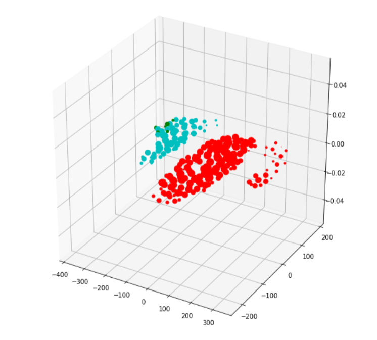
It is easy to visualize data that has 2 or even 3 dimensions. It gets tricker to do so once we move over 3 dimensions. t-SNE (t-Distributed Stochastic Neighbor Embedding) is a technique for dimensionality reduction that is particularly well suited for the visualization of high-dimensional datasets. Here, we will try to represent our 16 dimensional data (16 feature) in 3 dimensions.
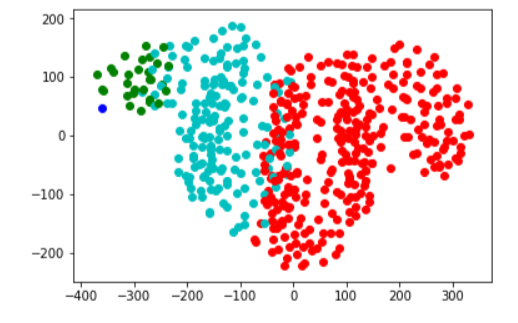
For a t-SNE plot, the relative distances between clusters or the relative distances within points of a single cluster do not signify anything. It is just a way of visually representing the separation of clusters.
Each color in the below plot represents one cluster in 3 dimensions.
Here is a top view of the same plot in 2d.
Studying the clusters
Here is a look at the statistics from some of the clusters we made:
Cluster 1:
Column | Mode | Mode count | Mean |
annual_inc | 60000 | 348 | 42513.39 |
loan_amnt | 12000 | 333 | 9629 |
Cluster 3:
Column | Mode | Mode count | Mean |
annual_inc | 120000 | 138 | 144498.73 |
loan_amnt | 35000 | 140 | 19115.25 |
We can see that the clusters are somewhat based on annual income and its relate features. The two clusters with the highest count have somewhat similar mean and mode annual income but vary mostly based on the installments. The cluster with lower count has drastically higher mean and mode income.
These factors along with other statistics can be taken into consideration while selection of models.
We use various metrics to judge model performance. Some of the metrics we will be using are:
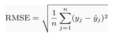
Root Mean Squared Error
It represents the sample standard deviation of the differences between predicted values and observed values.
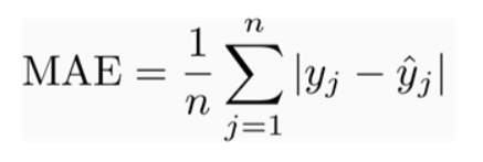
Mean Absolute Error
MAE is the average of the absolute difference between the predicted values and observed value. The MAE is a linear score which means that all the individual differences are weighted equally in the average.
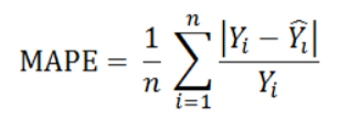
Mean Absolute Percent Error
MAPE measures the size of the error in percentage terms. It is calculated as the average of the unsigned percentage error.
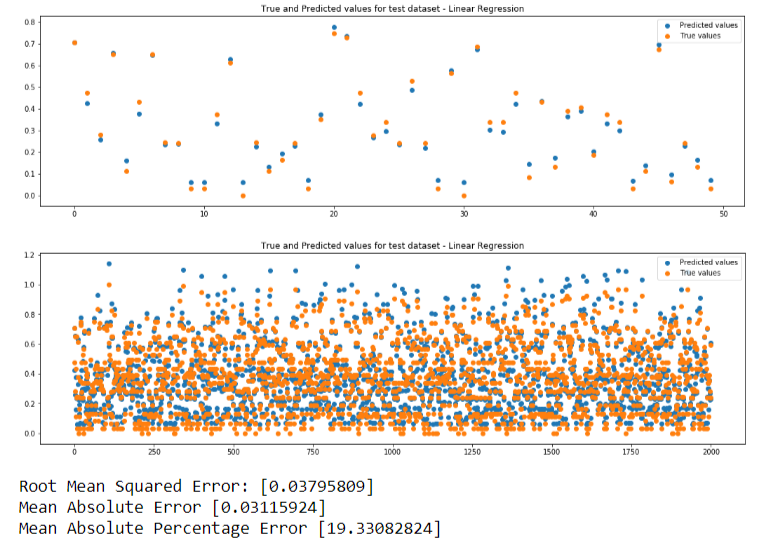
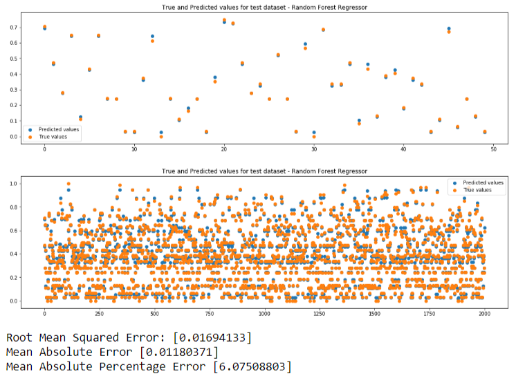
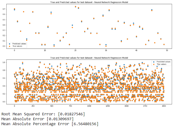
We will be performing predictions so we need regression models.We will be using 3 machine learning models. If predicted value is same as true value, the points in the plots will be overlapping. Closer the points, better is the prediction.
- Linear Regression
- Random Forest Regression
- Neural Network - Multilayer Perceptron
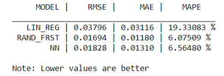
Here is a comparison of the metrics from the 3 models:
In the next lab, we will look into in depth ways of evaluating machine learning models and the different hyperparameters involved in the training of the model.
To save a model for future use, one way is to use the pickle module provided by python. It saves a python object as a file and can be imported later into another program. We will use the pickled models from this lab in our next lab.
We can use this trained model to predict the interest rates for new data.