Description of the dataset
This dataset issued by LendingClub, an American peer-to-peer lending company. The dataset contains loan data issued between August and December in 2011. It describes about 10,000 individual profiles with 17 variables, including the loan amount, interest rate, home ownership, number of finance inquiries, and among others. How can we cluster the data? How would you define some characteristics of each cluster?
What you will build
- K-medoids clustering
- Hierarchical clustering
What you will learn
In this project, you will learn how to:
- Read and pre-processing the data by using R
- Understand unsupervised learning method: clustering
- Cluster the data using K-medoids clustering and visualize the clusters with reduced-dimension
- Cluster the data using hierarchical clustering and plot the resulting dendrogram
- dplry
- cluster
- Rtsne
- ggplot2
First, read "LendingClubLoan.csv" dataset and select all the columns except "loan_status_Binary". The summary of dataset should be like this:
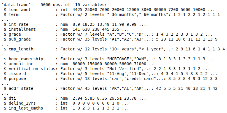
We will use Gower's distance to measure the distance between two entity. The attribute of entity may contain combinations of logical, numerical, categorical or text data. The distance is calculated as a number between 0 (identical) and 1 (maximally dissimilar).
Then, check attributes to ensure the correct methods are being used. ( I = interval, N = Nominal)

Now, try to output the most similar and dissimilar pairs in your gower distance matrix.
- Most similar pair

- Most dissimilar pair

From the output, you can see that the most similar pair have similar loan information, such as loan amount, grade and interest rate, while the most dissimilar pair are very different from each other. By using Gower distance, you can find some relationships in data.
One method to select the number of clusters is to compute the mean Silhouette Coefficient of all samples and select the number with best performance.
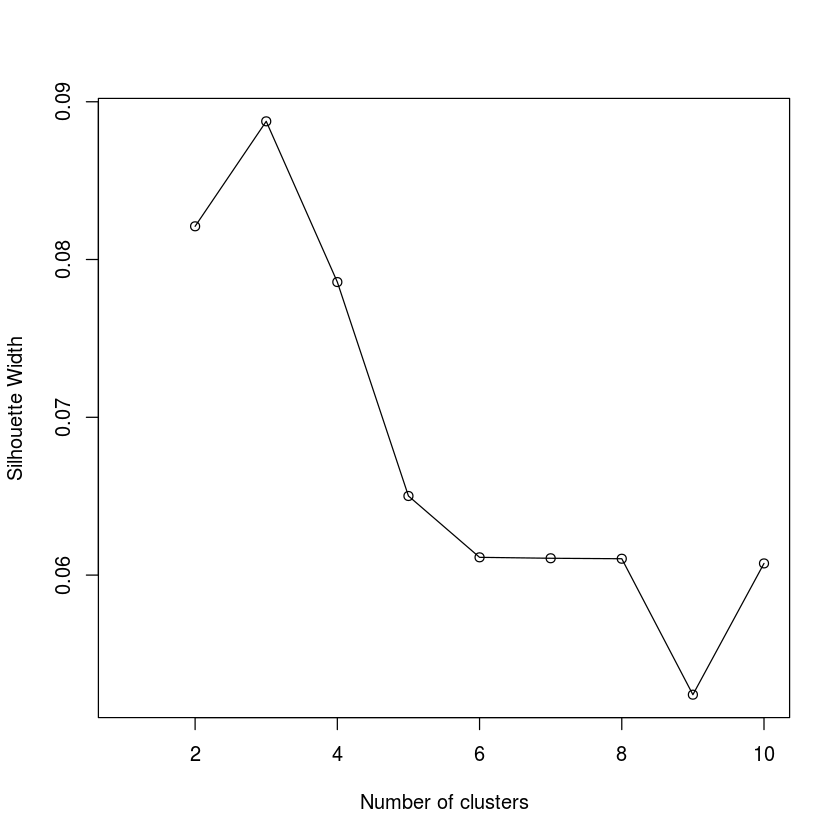
From the Silhouette Score plotting, the score drops dramatically from 3 to 4 clusters, where you can see the highest score. It seems like 3 is the optimal number of clusters.
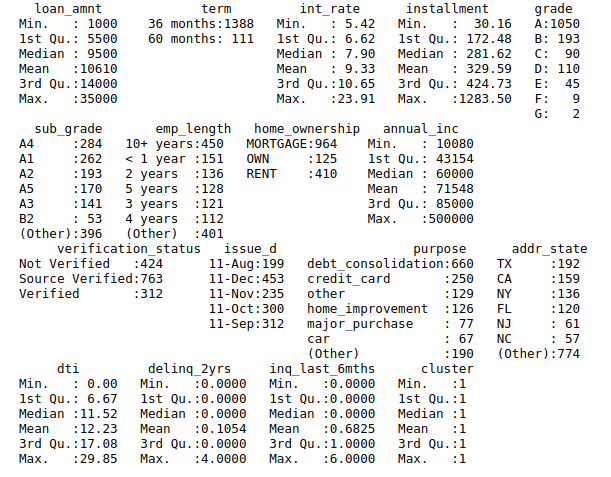
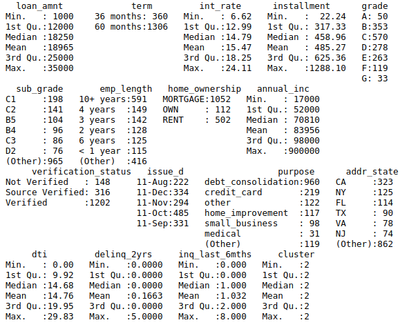
The PAM algorithm is very similar to K-means, mostly because both are partitional algorithms, in other words, they break the dataset into groups (= clustering), while also trying to minimize the error. The result below shows each cluster:
Cluster 1
Cluster 2
Cluster 3
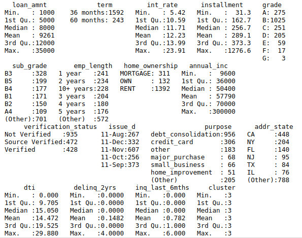
From the summary, you can see that the loan_amnt, int_rate and grade have significant difference among the clusters.
Observing medoid in each cluster
In order to have a better idea on each cluster, you can have a look at the medoid in each cluster. Each cluster is different especially in the loan_amnt, grade, and int_rate, which would become significant features for clustering.

Visualizing on reduced-dimension
Use Rtsne package which allows you to reduce the number of dimensions.
The clustering plot should be like this:
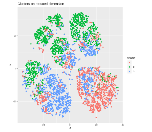
The performance of clustering looks good.
Plotting clusters over two variables
You can try to plot the clusters over several variables, which can help you understand how the model separates the clusters.
For example, the variables you can use are "loan_anmt", "grade" and "int_rate". When the "loan_anmt" is picked for the x-axis, while "grade" and "int_rate" are picked for the y-axis, what can we tell from these graphs?
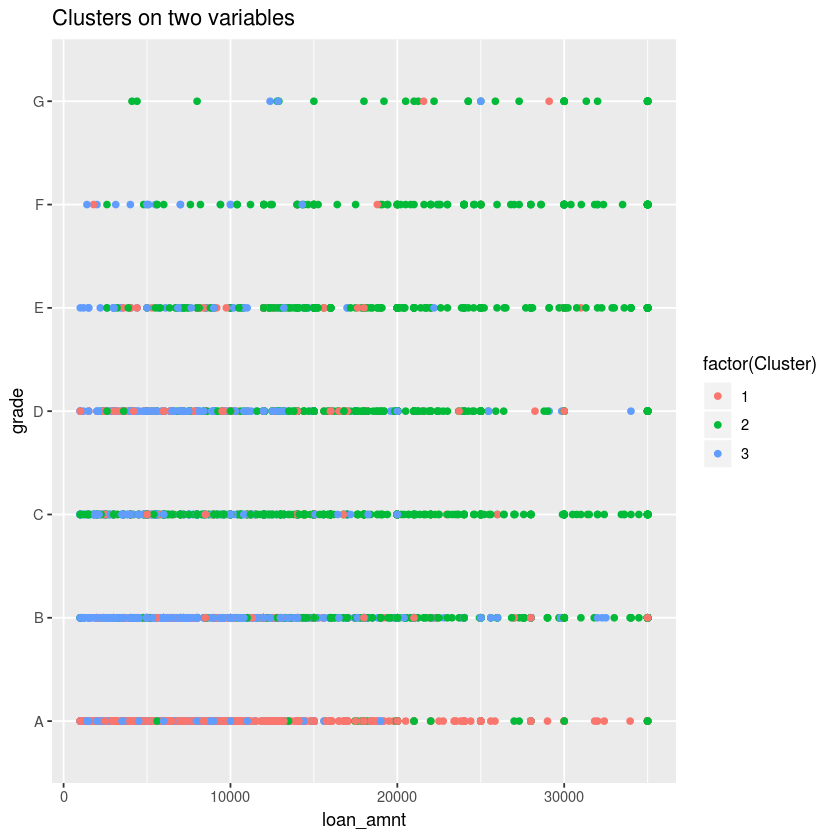
This plot shows the cluster 2 (green dot) has loan data with higher risk (lower grade, higher loan amount) while the cluster 1 (red dot) has the loan data with higher grade (A) and lower loan amount.
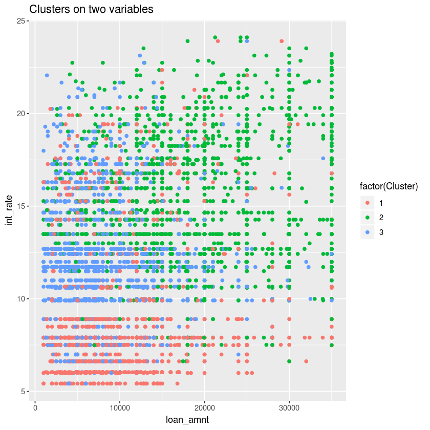
When it comes to interest rate, the cluster 2 (green dot) is characterized by high risk (higher interest rate and higher loan amount), while the cluster 1 (red dot) cluster represents lower interest rates and lower loan amount.
The algorithm of hierarchical clustering is a "bottom up" approach, where each observation starts in its own cluster, and pairs of clusters are merged as one moves up the hierarchy [1].
In the project, we can compute the hierarchical clustering using "manhattan" metrics. The dendrogram should be like this:
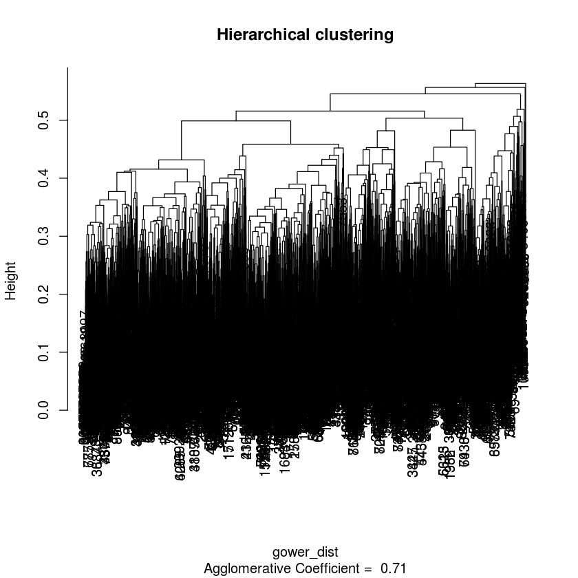
From the dendrograms, you can find 6 clusters which have large subsets relatively.
Visualizing on reduced-dimension
As what we did at the previous step, we use Rtsne package to reduce the number of dimensions.
The clustering plot should be like this:
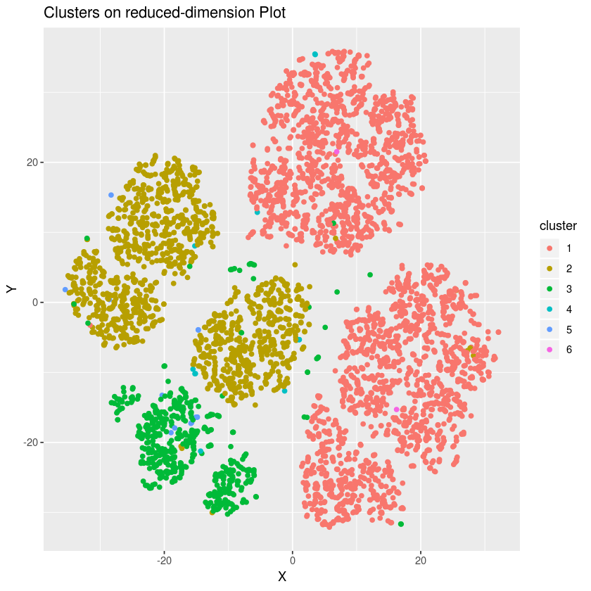
This model creates 6 clusters, 3 of which are large clusters in the plot (cluster 1, 2 and 3). The other 3 clusters are just outliers compared with the large clusters. The data is clustered better than PAM clustering as clearer boundaries are shown between clusters when hierarchical clustering method is used.
Plotting clusters over two variables
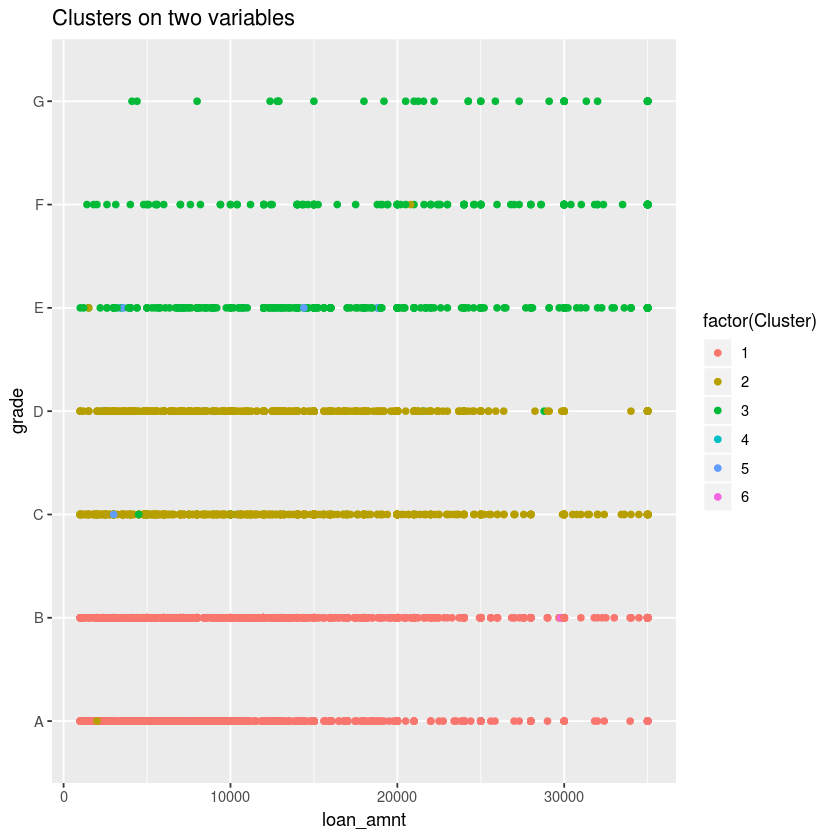
With 6 clusters, the plot shows cluster 3 (green dot) has a characteristic of high risk (low grade, high loan amount), while cluster 1 (red dot) have high grade and smaller amount of loan.
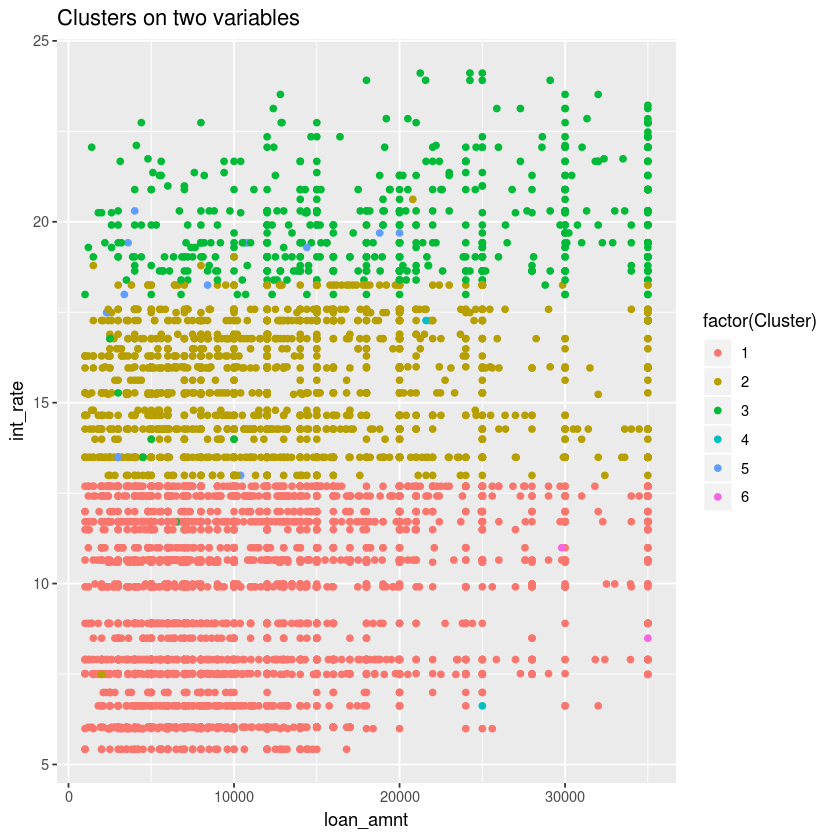
Similar to the insight gained from the previous plot, we can conclude from this plot that the cluster 3 (green dot) has high risk, with highest interest (around 17.5% up to 24%) and the larger amount of loan (high concentration around 30000 to 35000 is seen compared with the other clusters). In contrast, cluster 1 (red dot) is characterized by the lowest interest rates (5% to 12.5%), and it is also seen at the lower loan amount.
- Data source: Kaggle. Lending Club.
- Wikipedia. Hierarchical clustering. Retrieved from https://en.wikipedia.org/wiki/Hierarchical_clustering